Demonstration · Illustrative data · BI Consulting Services
Dexcom×BI Consulting Services
Prepared for Katy · Payer Analytics & Operations September 2026
The board your team would build on Day 1 — gross‑to‑net, rebate accruals and the rebate‑processor pipeline, in one view
You wrote that your direct team does not have much experience with the tool Dexcom uses heavily, that you wanted anywhere from creating dashboards, data visualization, reports, analytics, and hands‑on help with the Data Pipeline that feeds data from our third‑party rebate processor. This is that training, expressed as the finished artefact: every tile, chart and callout below maps to a module of the 1–2 day on‑site.
Gross‑to‑net by quarter — accrued vs invoiced by the rebate processor
Rebates accrued in the model vs. rebates actually invoiced by the third‑party processor, $M. The gap is what Payer Ops chases.
Rebate accrued (model)Rebate invoiced (processor)Shaded band = accrued − invoiced gap
Where the rows go, where they fall out, and how fresh the extract is. This is the Day 2 lab: you trace one rebate claim from the processor file to the tile it lands in.
Rebate by payer channel — accrued $M and effective rebate rate
Ranked by accrued rebate in the selected period. Rate = rebate ÷ gross. Formulary status is the Day 1 afternoon “conditional formatting” exercise.
Product mix in scope
Net revenue share by product for the current filters.
How the 1–2 day on‑site maps to this board
Built around your February‑style annual on‑site in San Diego. Every module ends with a piece of this page existing in your own workbook, on your own rebate extract.
Day 1Dashboards, data visualization, reports
09:00Connect to the rebate extract. Live vs extract, joins vs relationships, the gross‑to‑net data model.
10:30Build the KPI row. Calculated fields, quarter‑over‑quarter deltas, the trend‑arrow glyphs you see above.
13:00The accrued‑vs‑invoiced trend. Dual‑measure line, reference bands, tooltips that explain the variance.
14:30Channel ranking & formulary status. Sorting, table calcs, conditional colour — then dashboard actions and filters.
09:00Walk the pipeline. Processor file → landing → validation → accrual model → extract. What each step owes the next.
10:30Reconcile a quarter. Trace rejected rows and late invoices; build the freshness and reject tiles.
13:00Level‑of‑detail calcs for gross‑to‑net. Rate by channel, by product, by plan — without double counting.
14:30Your data, your questions. Open lab on Dexcom’s own workbooks; office hours for the analysts.
16:00Hand‑off. Documented model, naming standards, a 30‑day follow‑up checklist.
Also from BI Consulting Services
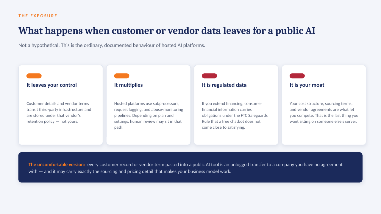
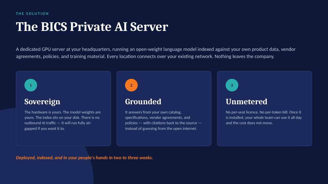
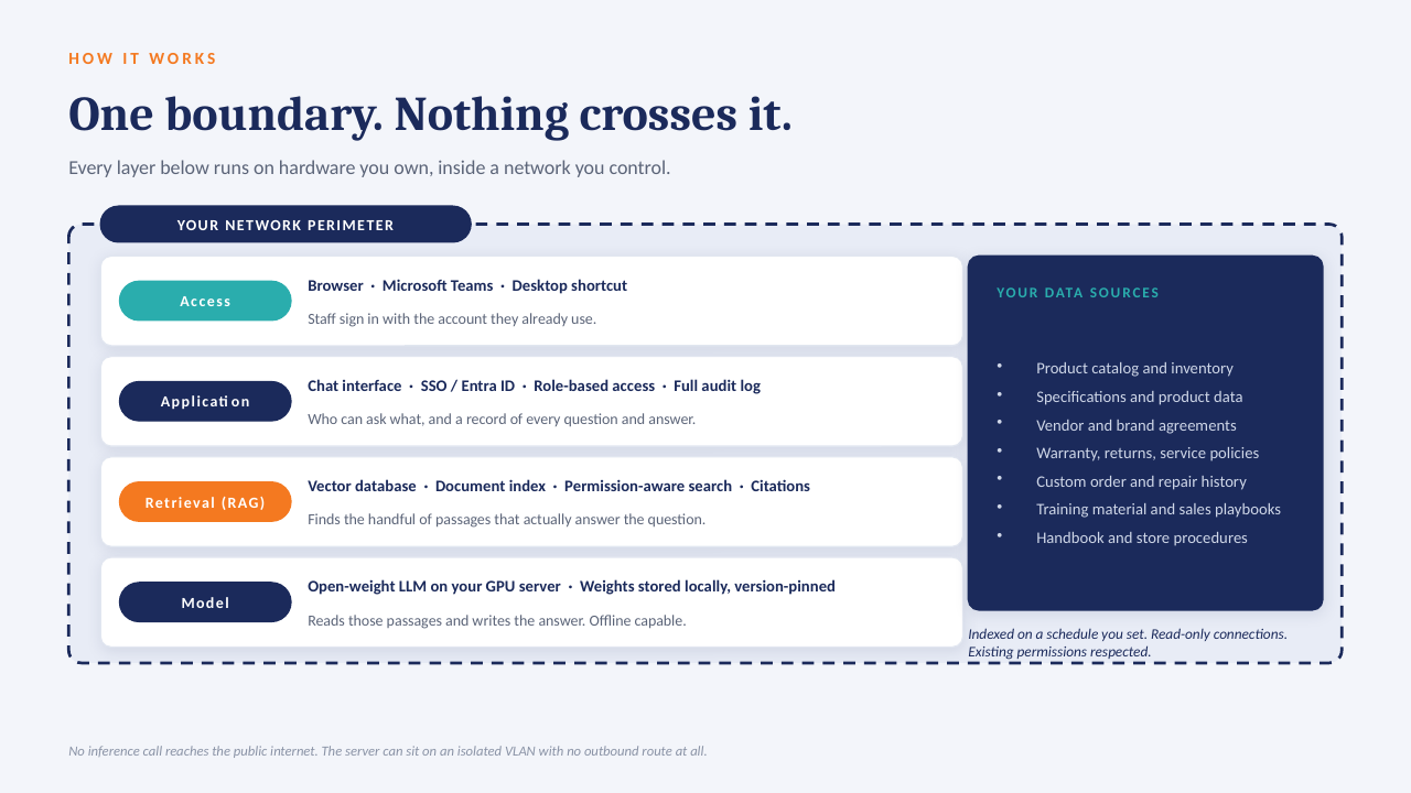
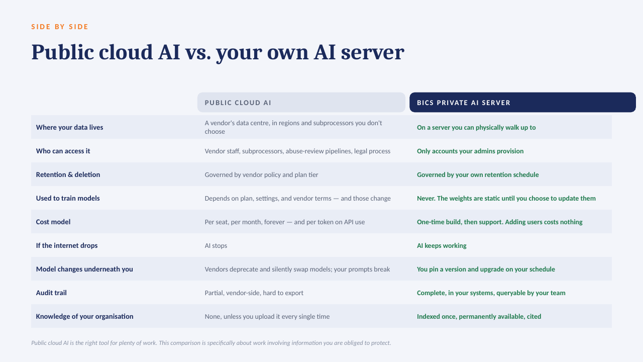
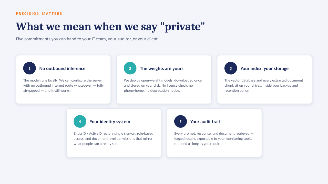
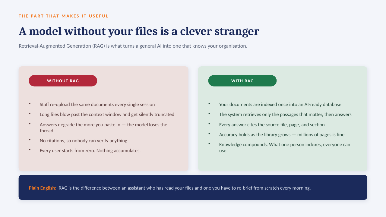
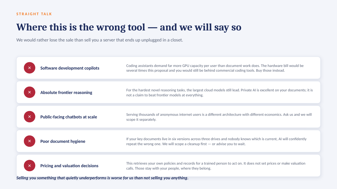
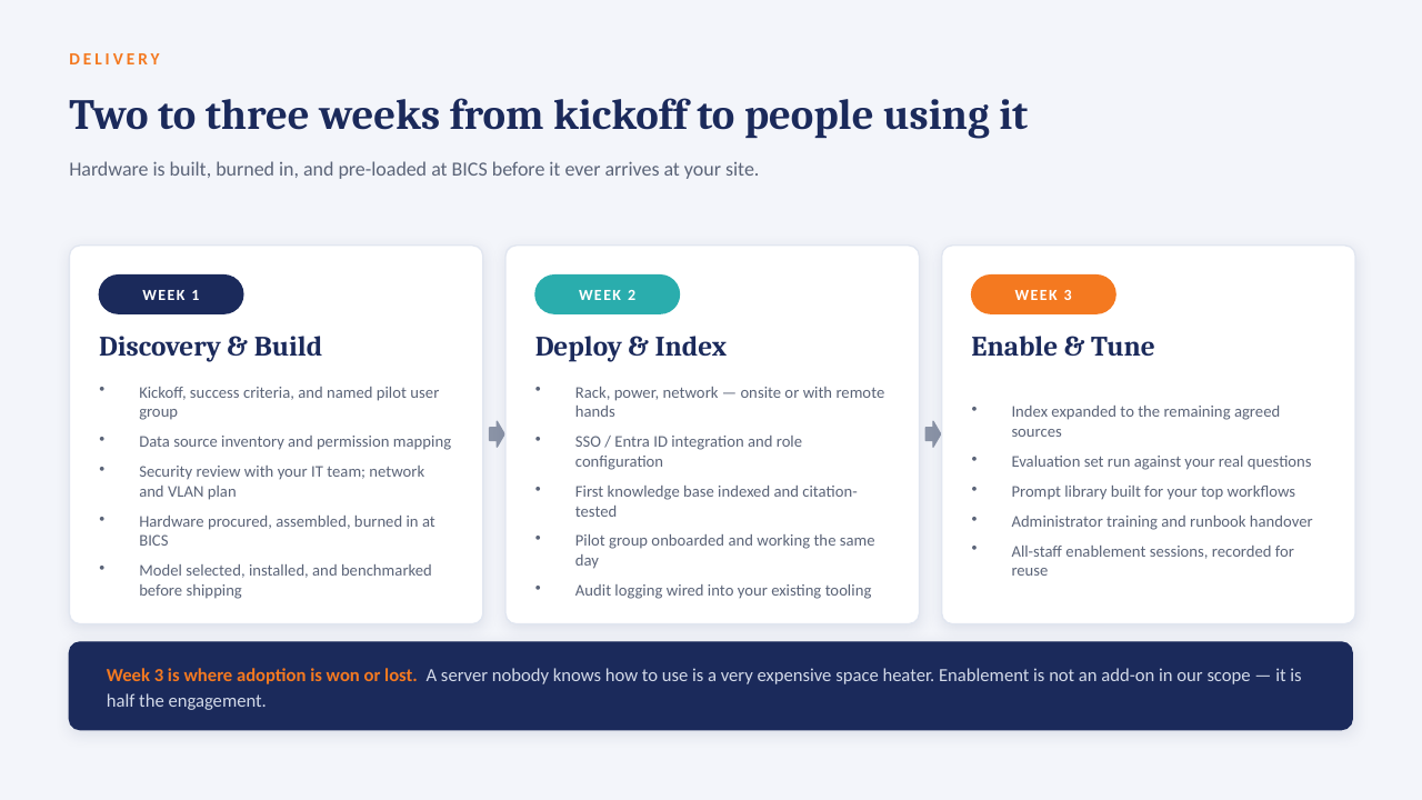
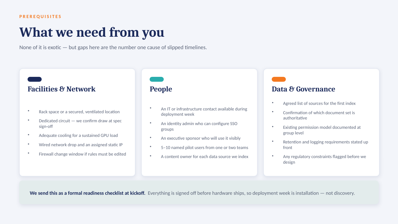
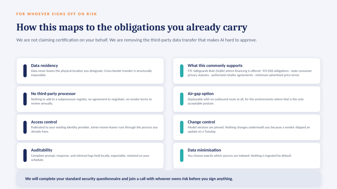
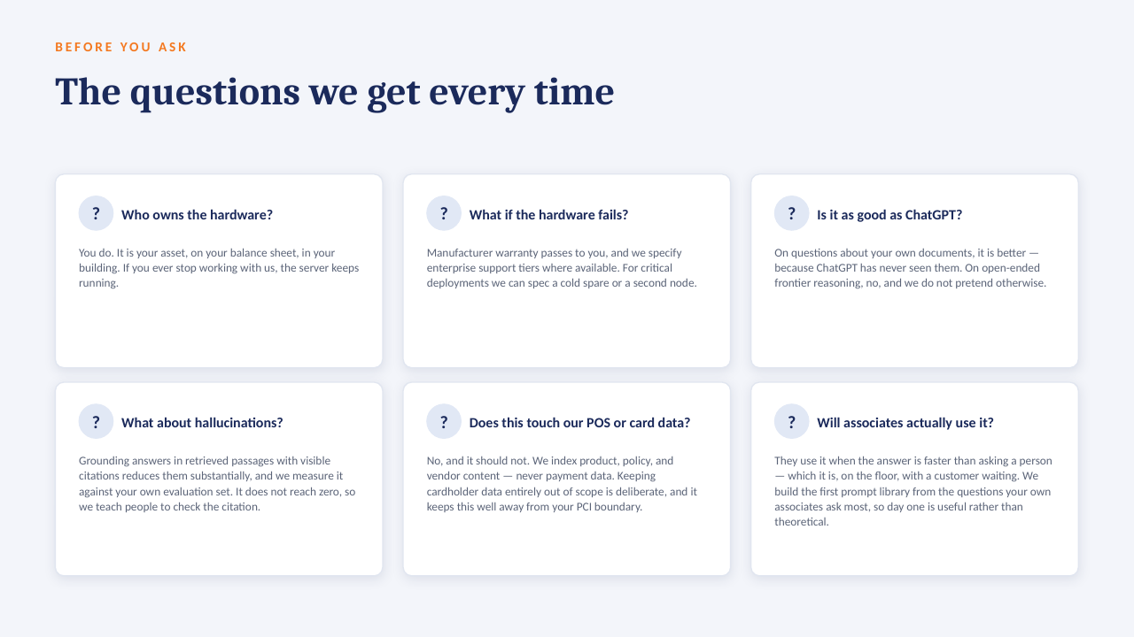
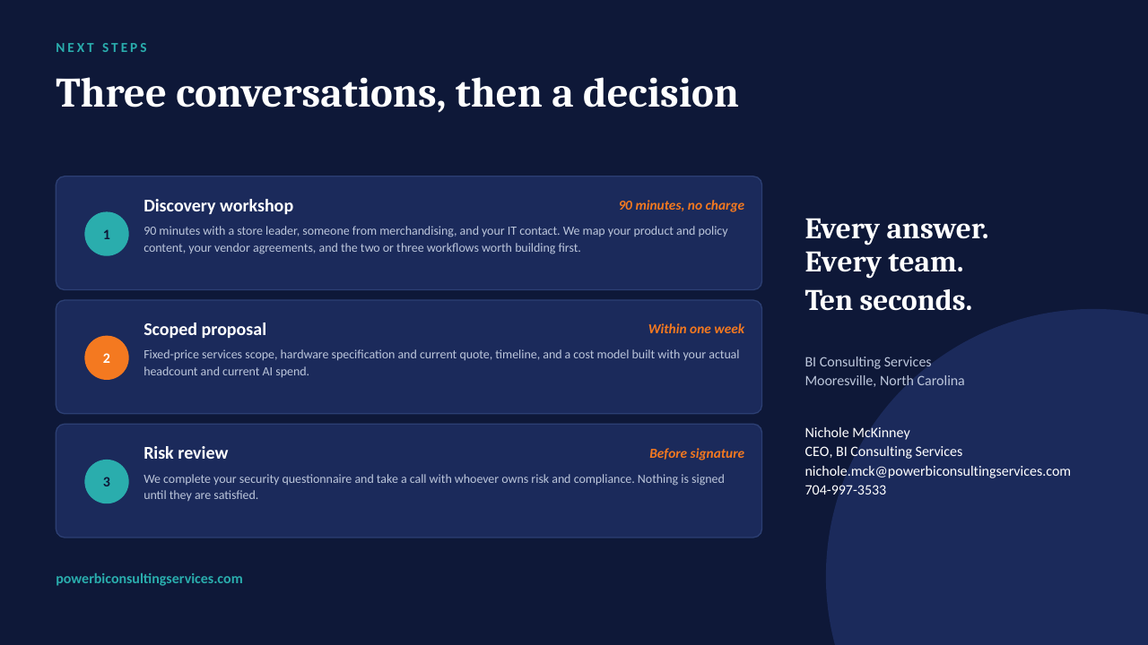
Private AI on your own server
The "ask the data" ideas on this board are designed to run on a GPU server inside your own network — an open-weight model over your own documents, cited answers, no per-seat licence, nothing leaving the building. The short deck below explains how it works. Scroll through, or download it as a PDF.